Design Tips
1. Pick a Purpose
What does your shelf wobbler or shelf talker actually say? Does it offer something useful to your potential customers?
Define the purpose of your shelf displays, and ensure the design and message reflects that purpose.
Are you pointing customers to your latest product release – and giving them a reason to pick it up via your USP? Are you highlighting a special offer or cross-promotion? Are you helping shoppers navigate your store aisles and identify shelf categories?


2. Keep It Simple
As customers step into a new shopping aisle, they’re bombarded with new visual information.
In order to catch their eye, your shelf talker/wobbler design should be highly visible and legible – even from a distance.
Use a large, clear typeface and keep your marketing message concise to draw buyers in. Stick to two or three high-contrast colours. Be minimalist with any graphics. Avoid cluttered designs and smaller text wherever possible.
If you need to provide more information in a smaller font (such as terms and conditions for a contest, for example), at least ensure your primary message takes centre stage with big bold and super-brief text.
3. Use Creative Shapes
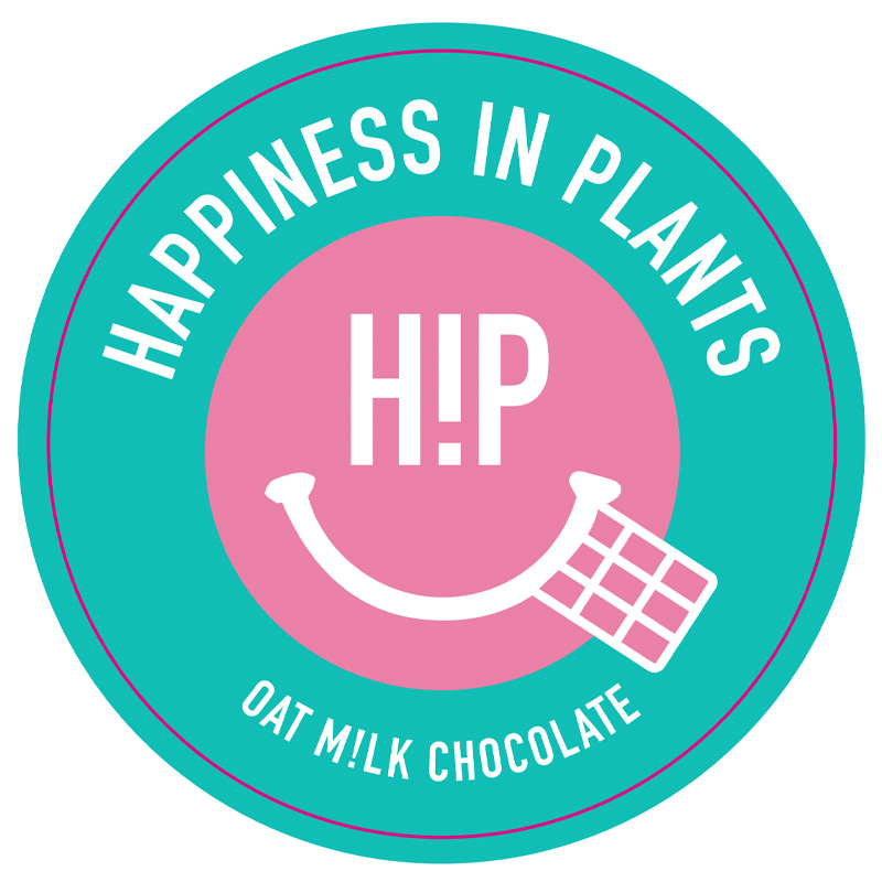
Square and circle shelf wobblers/talkers can look great, but sometimes they can blend into the background; particularly if you’re a product manufacturer essentially competing with your retailer partners’ own shelf display accessories.
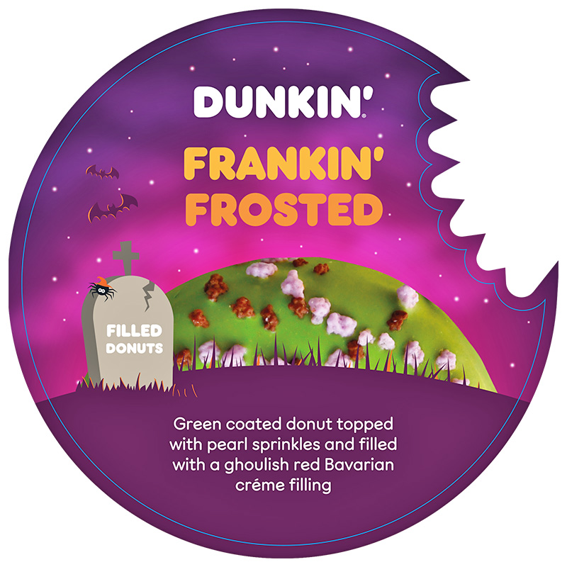
For maximum visual impact, we’d recommend choosing a more unusual and unexpected shelf display card shape.
Why not choose a shape which resembles your product (such as a bottle shape for drinks and condiments)? Or perhaps a card shape cut to the contours of your design’s graphics?


4. Push People to Your Online Presence
According to Deloitte 57% of consumers research products in-store and purchase online. When they’re having trouble making a buying decision, many customers will take out their smartphones in the shopping aisle to find more information on the products in front of them.
With this in mind, it’s wise to use your shelf wobbler or shelf talker design to push physical customers to your digital channels.
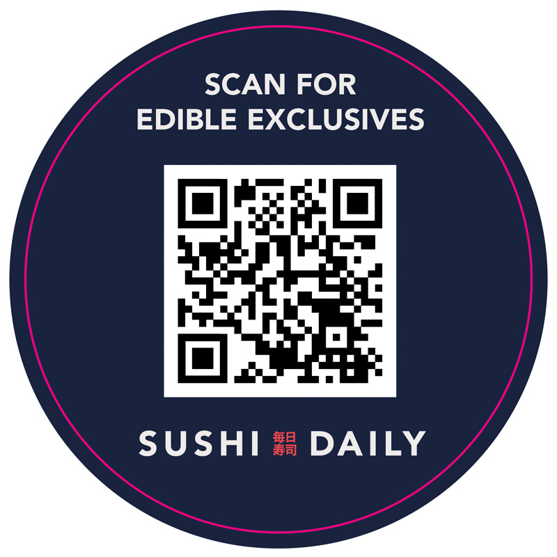
Offer up a URL where buyers can discover more about your products – or better yet, add a scannable QR code to take them straight to your site.
You can also highlight your social media handles to bring in more followers, advertise online or text entry competition giveaways, or entice customers to sign up to your online membership programme so they can gain access to exclusive in-store offers.
Need help with preparing your design?
Get in touch for expert advice and support today